Spring drawings 2014 and the return to blogging!

Okay, I should first apologise for my mass absence from blogging, if anyone is still reading my many past ramblings that is…So the thing is, since my last visit on here much has changed, I had a spate of unemployment which funny enough was great on the creation front of things, but not so much on the wealth. And now live in the opposite of this, with money and a job, but no proper time for creativity and blogging, and real time has to be used wisely and has to be well organised in advance.

I created a few designs in my stage of unemployment that were of a new level and technique, it was more a stage of exploration as a designer of where to head next and to test capabilities, so thought that it is only right to show some of the stuff that is in need of dusting off and showing to you, my loyal followers and readers, this is for you, and in the coming days/weeks more shall be shown bit by bit.

Echosmith Gentleman #1

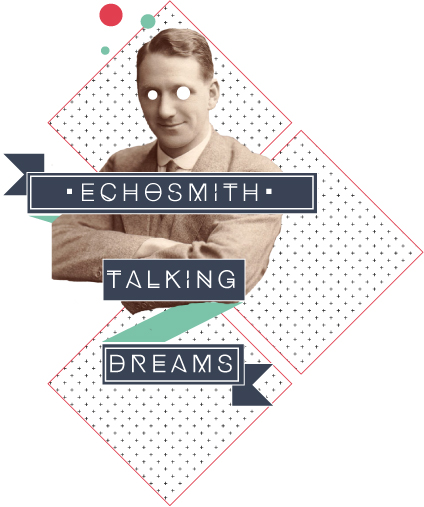
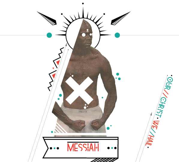
These  piece consist of my experimentations of building design upon photographs, and putting my own unique style and spin on a more unusual subject. It meant going out of my comfort zone, but getting back to my design roots really inspired me, but still maintaining my stylistic twist.

Echosmith Lady

I began exploring a world of colour that would run throughout both this set of work and flow into future workings, connecting all my work together as one, allowing more people to recognise my style and the work to be mine.

Echosmith Gentleman

I wanted a level of symmetry, thus the use of shape and banners throughout the 3 individuals, as well as a hint of my character approach, the blanking out of eyes, as secretly I can’t master the correct shading and depth of an eye, but can draw hands all day long, loving the mechanics and pose they can offer. Slight tangent but fairly relevant within my summarising, this post leads onto the next level of technique and self progression, with myself playing more on the basis of surroundings, and posture of characters, characters that have evolved greatly from the early  days, some of which were shown almost an age ago upon here and are ever so dated now….so unttil next time, stay tuned folks

The grand return of “what inspires me?”

Thank you to all loyal viewer’s out there in the big wide world, I am touched to see just how many people are still reading my stuff. So I owe you all a huge apology for being absent for so long and not posting, shamefully! You will be glad to know however, that new and fresh posts/feed will be appearing as of tomorrow, with the poster of the week rekindling, my own work making an appearance and much more inspiration for you to all get your teeth sunk into.


Until tomorrow…

I leave you with this lil preview and incentive for now

#2

“Screenadelica”, gig posters


_MG_4467

During the weekend I attended the “Screenadelica” gig poster event in Liverpool after keeping an eye out for the event ever since learning about it almost 2 years ago. It was a chance to meet like minded people like myself who share a similar passion in the gig posters and the screenprint industry. On show they had artists ranging from Luke Drozd, Drew Millward, Anonymous Ink plus many more, it was a chance to actually see posters in their full glory where you can truly appreciate the time and effort put into them, where as upon the computer screen alot of this is lost and often ignorance is shown to such a amazing art form.

_MG_4459

I myself happened to make a purchase of a stunning print for the band “Dinosaur Jr” by the ever so talented Luke Drozd, showing support for fellow printers that I hope to one day step into their league and appreciate the given support myself. As well as not being to help myself when surrounded by such lovely pieces on display and decided to add to the ever growing collection of mine now numbering over 7 prints.

_MG_4545


As a whole the day was both inspirational to me as someone who wants to go into such a field and educational towards the talent/opposition in the industry that I shall have to face sooner or later. But it gave a clear insight into what it is that I’m going to do with my future, and also spurred me into applying for a scholarship in print. Allowing great progression in my work and advancing in the techniques that I already know in screenprint, increasing my talent hopefully as well as works for when I step into the industry full time. More about the scholarship shall be done in greater detail within the next post, highlighting all criteria, demands and as well as what I will actually get out of it.


p.s wish I had now purchased this as well for “The Raconteurs”!

_MG_4463

Welcome “Kid Cactus” & “Yokel”


Lets all give a warm and a gentle welcome to “Kid Cactus” & “Yokel” hoping to become a focus point upon my stall tomorrow and in the days, months and years to come….its the beginning of a new era and something new at Pirate_fly* from the emergence of graphic design and love for illustration.
yokel final


(Above) This guy has been in the process of being made since the very first day of scribbling him upon the canteen table and thus had to bring him to life at a later date. And thought it only right that he be my first of many characters to come, with him being there in the beginning when my love for gig posters and the characters they feature with their own personal styles. The typefaces were to be kept simple, and link the two illustrations together and create almost a connection in my work for my future audiences.

(Below) we have a simple mock up of the poster to be, and have printed out a digital copy to give folks a glimpse of what’s to come and almost a preview if interested that they can later  own if they take my details or enquire.


Poster mock up


Miniature “Kid Cactus” cards ready for purchase  all signed and set out with contact details for all possible purchasers, and will soon feature as an A1 screen printed banner in the coming weeks. Consisting of 4 colours, so keep an eye out on these lil guys that have proved to be of great popularity in short a short space of creation…literally 5 days.


_MG_4378

“Manchester Print Fair 2013” Pirate_fly stall

_MG_4368

Over the last few weeks that have passed by in the name of Pirate fly prints I’ve been none stop screenprinting and character creating to get everything ready for the big day that’s been looming since the day of purchasing my stall.  Its only been the last few days that I’ve actually removed myself away from the print bench and never ending applying of colours to various prints that I hope to sell and promote myself with.

_MG_4371


As can be seen within the photo’s on display, you can witness the sheer variation that’s on offer ranging from A6 cards featuring the ever liked Monsters with Moustaches, to coaster sized cards of the recent creation of a favourite of mine “yokel” and his partner in crime “Kid Cactus”. Both appearing as a joint venture on the new character front that shall soon be seen featuring in the emergence of new gig posters throughout the year! Adopting a style of my own that has grown from influences such as “Army of Cats” Graham Pilling, Drew Millward, Fairey and Olly Moss.

_MG_4375


Tomorrow I shall be setting off with everything packed ready in their own individual bundles and packages ready to be transported all of nearly a hour and a half away, far from the countryside scenes to the design centre that I hope to emerge into, fingers crossed from tomorrows possible connections, new contacts and passing around of details. It should be in hindsight a great success, it would be nice as a student to make some profit off it all, but that isn’t my priotrity, I just want some sort of recognition, mingle and get my foot in amongst creatives like myself, which is hard in my current area!

_MG_4378

Tags have been pre made in preparation for the venture, varying between prices (which are just and slightly undervalued as told) friendly help yourselves and promotion for up coming screenprints up for purchase in the coming weeks. Also upon each poster, mini print and card are my email and name for people to keep a note of who I am and also receive a miniature “Kid Cactus” card with Facebook page details added. Upon the table wwill be details for people to get hold of me using the power of social media!

_MG_4366


So come along to Manchester tomorrow, find me at my stall and check out my work, even make a purchase if something is to catch your eye! If not, then don’t worry, stay vigilant and watch this blog for follow up posts including that of my setting up of the stall, display, the day itself and works, so enjoi.

“Poster of the Week” Game of Thrones by HBO

Game of Thrones season 3 character posters Jon Snow

Apologies to those who actually read my blog for missing the previous weeks poster post, down to a week of creative futures talks. So this week shall see two poster posts for you all to enjoy!

“Poster of the Week” goes to….HBO for their new release character posters for the ever so popular and desired return of “Game of Thrones”. It’s not technically in the vein of gig posters with the likes of Shepard Fairey’s and Drew Millwards work that have been seen through the last so many “Poster of the Weeks”, but I thought why not include the digitally created poster pieces. Thus I had no other choice but to select this beautifully created masterpiece and do a feature upon it before the show airs come the end of March.

Game of Thrones season 3 character posters Tyrion

The collection created was to feature 12 varying characters who feature throughout the series and have become favourites of the fandom. Especially with each of the characters playing their own individual part and story in the second series that were left open, therefore hold a greater presence being upon these prints due to the importance that they are bound to bring with them into the third series. With Jon’s capture beyond the wall, Tyrions battle saving the throne for the hateful king Joff. Each poster plays a part of a much bigger and broader picture that is soon t be unveiled as the new series unfurls. I found what set these posters out as something truly great and memorable was the way in which they featured the subtle hint of blue clouding the left hand side of the characters features.

To me that was almost a sure fire hint at “The winters coming” saying, with winter truly coming to the land of Westeros in the coming weeks. Its cleverly designed as to not give much away, but still lead you the audience onto speculate your own thoughts of what’s to come and how each of these characters may become affected.The blue tinge also plays well with the composition of the taken photo of the character, with it blending in well with the toned down colours of skin, hair and other features, but most of all sets out the eye colour. The eye colour I found to almost lure you in, with the boldness now centered around the one characteristic due to lack of all other colours, acting flat. The eye adds emotion to each of the prints, captivating you the audience, and still intriguing you as to what it is that could be going through their minds as captured in the photo. Its such a imaginative technique as to lead onto intrigue and wonder within  fandom. Relating back to the blue as well, it in my mind almost creates a good vs evil image, or a character that has something to hide, due to half the face being covered. Conjuring up the idea of what’s this character going to do in this series, what dark consequences are going to surround them and the blue again keeping in mind what’s rapidly approaching to the north. Nothing in the image gives too much away, but neither does it allow you to simply forget what’s gone before in the past series and what clues you’ve thought up yourself.

With the coming of the new series, not only has it seen a rise in popularity, its also seen more and more creations revolving Game of Thrones. Especailly with the works that Mondo has featured and put up as an exhibition, showing the great range of what there is to offer from production. With prices set from $1500 upto the dizzying heights of $15000, showing instantly the demand for such a franchises artwork and how much is actually getting produced over the series.

Kilian-GOT-press

“If only I had known” with Sian Saunders

“Good things come in small packages, so don’t be fooled by our size, we do big things!”

Having received the timetable for the week of lectures, “If only I had known” intrigued me from the first sight, setting me off to find out about what it entailed and who the speaker was. The insight of looking ahead paid off, having found it to be a collective of around 6 members branching off into varying fields of designs, ranging from web, illustration and graphics, all of which ran under the name of Daydream Design. The main manager and runner of the group was Sian Saunders, a ever so friendly host, making you instantly feel welcome and in a place that makes you feel like you belong through both the ease of presentation and through the body of work that represents them.

We were told from the start, that people want the world for nothing, so what are we as designers expected to do. Especially with the mission of limited funds, time and ambition towards something that may not necessarily be attractive to you, I went along with the answer to this that Sian gave, how the rejected projects from other studio’s or those jobs that look impossible, make them possible, and accept the challenge. It normally brings out the best work in you and shows other possible clients what you can produce from the jobs that nobody was expecting to turn out as good as it did. Also it was drummed into us, as well as made clear, that its all about doing that one unique element, that extra mile within a project. Take the wonderful creativity behind “The Real Ale Trail, Flintshire” (http://www.realaletrailflintshire.co.uk/) where we caught an actual glimpse of just how far the folks are prepared to go, with such simple design. With a basic pint glass that starts to lessen its load the further down the page you read, its purely clever and just keeps you captivated as an audience, seeing the true meaning of what it is that the website is offering you, making a site on beer much more enjoyable.

We were then presented with pointers that would ensure that we designer are ready for the design industry, with advice first hand from a successful and growing group, that has gone from strength to strength. With each point simply being memorable, short & sweet, as well as that kick that I as a soon to be graduate needs.

Daydream Designs top 5 tips:

-Stand out from the crowd, design with personality,

-We’re hardwired to notice only what’s different,

-It’s all about the customers, we listen. However good you are it means nothing unless you listened in the first place to the requirements,

-Live by design, not by default. So just go that extra mile,

-Perspective, see things differently and stay curious.

With such tips, how can you ever stray or go off the path knowing what it is that studio’s look for and desire in fresh creative’s. Every point made was valid and relevant with the hope of meeting standards; they almost expected and shouldn’t have to be pointed out if you have any ambitions of doing well. My only problem would occur in the “Different” in order to get noticed in the 1st place, with them receiving so many applications and portfolios through their door, it would be a mission alone for them to consider me. Thus this I shall take from today and start work upon how it will be achieved.

Creative Agency North Wales | Home

“From student to artist” with Michael Robinson

“Where are you now & where do you want to be?”

Such words that truly got me thinking. What am I actually wanting to achieve as a graphic designer, is it the field of graphic design that I still want with the crossovers into graphic illustration and print, or am I to stray away from the dream that I’ve had since beginning uni. As of right now I can simply say, I am working away, producing the style of graphics that is expected of me and being restricted in what it is that is I want to create. The desire to draw the unusual, and tackle projects with my own style seems to not be acceptable, so I am afraid I am not where I want to be. But can combat that with where I am hoping to be, come graduation later this year.  With the wanting to be screenprinting and producing gig posters, or become part of a studio’s team truly creating the inspirational.

The guest speaker Michael Robinson, in a matter of seconds had the room pondering themselves and exploring into their own creativity with a greater depth. Having gone through the same experience and now passing on what he knows and what he had to go through to get to where he is now. All of which proved to be of great value to us, and most of all myself, taking note of every gram of advice. What stuck with me most and still does is “The fear of beginning is bigger than the actuality of doing”. Changing my view now as a designer, knowing that everyone goes through the same process, but as soon as a task is to come my way I am to scribble anything and everything down that is simply in my head however little it may have towards relevance. It gets me over that beginning hurdle. And will now become a part of my process in future creativity ventures. Once over the whole stigma of being bogged down at the starting grid, consider every location that could become the home to your work, whether its a cafe, library or window of an empty shop, it’s an opportunity for your work to be seen. Taking such risks like Michael did, and asking, gets you places that you wouldn’t necessarily expect to be. He asked for the most hardest to reach wall up three flights of stairs to feature as a home to his artwork, a truly impressive prospective when you think about it. And when finding a studio, managing to hook up and share a studio all off the back of asking, a motto of his that seems to get you far.

Through all of Michael’s endeavours and experiences, the one thing that he couldn’t avoid was doing the drab and the work that you morally never wanted to have to result in doing.  A prospect that we as designers want to stray away from and is a thought of mine that I don’t really want to result in doing, But still know that it could be something that I end up doing, especially if my desires and ambitions either don’t take off or aren’t fulfilled.

“Teaching as an option” with Ursula Byrne

“What’s it like to be on the teaching side, no longer the student”

I decided to head towards a talk that would be completely different and hopefully give unexpected information in an area that I know little about, thus deciding to sit in on “Teaching as an option”. Teaching has never really crossed my mind before, I’ve always thought of myself as either part of a team within a studio or freelance in screen print, so the talk opened up other avenues I hoped, if all else failed or that I perhaps had a chance within teaching but hadn’t really be made aware of what it requires. And straight off Ursula asked the question of how much do we enjoy our job or profession that we hope to go into? This at first sounded rather pointless to begin with, as I wouldn’t be doing a degree in graphics if I did not enjoy it. But it was more of how much enjoyment would you gain from your job say doing it still 5 years down the road. Which I can’t answer truthfully as I don’t know, but am adamant and confident in myself that I can still draw enjoyment as long as it’s what I want and can openly say that about what I create.

Having kick started us with such a question, Ursula soon exposed us to hat it is to be a teacher, what we require, what it entails and what to expect. All of which took us by surprise, with the level of time needed in one whole year while undertaking a PGCE, the GCSE level boundaries shifting upwards to a B grade and the whole what will be expected of us upon a single interview for a role. With the likes of…

Why you want to be a teacher?

Interest in children

Communication and Interpersonal skills

Sense of humour

Energy, Determination and Perseverance

Some of which were expected, and others taking you by surprise, but firming up of how you should be kept on your guard and don’t go into an interview expecting to just breeze straight through, because it won’t happen and you’ll soon come unstuck.

The idea of heading down the teaching path surprised me at how much I actually considered, especially with it being a whole new concept, but having walked away at the end and given thought, I was still set on my path. I intend to finish with my degree, create gig posters, screen print an produce graphics, the things that generally make me happy, teaching I can’t see completing me or keeping me satisfied for however long of a career.

“Design & Illustration in illustrated publishing” with Yasia Williams-Leedham

“Just apply and email thousands of junior design jobs, wherever you live, try and it will prevail for opportunities”

I told myself that I had to go to a talk that would be completely different to all other talks that I may target within the week, thus going for an illustration and publishing lecture. I wasn’t all that sure as of what to expect, until hearing the intro to the talk by Yasia. Talking of her simple journey beginning from my own Glyndwr, and progressing to the great heights of deputy art director of the publishing group Octopus. This opening was got me hooked, it showed just what you can achieve, and if you set your sights from a small uni you really can go far, with her hitting up London and finding the success she has with the creation of such an array of splendid books ranging from the likes of “TOWIE” to an Ice cream book.

The Icecreamists

After seeing such great examples of what can be achieved through determination and imagination, it soon was made clear how incredibly hard it is to get into at the moment in time. With such a demand in cook books for example, it’s seen that with all the books on the shelf with all the same sort of cover, it’s a mission standing out. That’s where Octopus comes in, with its aim of creating that unique piece, i.e. the ginger pig featuring strong neon colours, especially bled across the pages axis. Something of which is what the cook book industry lacks, the fact of how nothing pushes back the boundaries, almost creating the perfect opportunity for someone different to step in. Half of the actual job it seemed to me is getting the target audience to pick up your book, and this is where appearing visually different gets you noticed in the likes of WHSmiths and Waterstones. The other half is remaining on topic and desired I found. With the likes of E-books stepping up their game more and more as the years come and go. With the year of 2010 showing the start of their popularity and the following year then saw a 117% increase of sales, a ridiculous percentage that now worries many within the publishing industry. The only way these companies can survive is to embrace the change, thus adopting the way books are now produced. It just goes to show how publishers are evolving with the times and allowing themselves to survive.

The Spiritual Guide to Attracting Love

What I took away from this most of all is, to look for niches and expose them, as well as move with the times. Never stay put, follow the trends and how the future is evolving in time like the shift in the publishing industry towards E-books, saving me from extinction in my design.